About the project
Samsung took the decision to create a training platform for employees of Service Centers, their business partners in service to repair their Customers' products, to raise awareness and prepare them to improve their service to customers.
Objectives
Develop a distance training academy with simple soft skills courses to improve the quality of customer service and cover all Service Centers in the country.
Challenges
- An approximate license plate of 750 users.
- Maintain consistency in users as the rotation staff is high.
- Create versatile and entertaining content because users don’t have plenty of time to take courses.
- Constant communication with users to maintain theminformed about the contents and dynamics.
- Generate communication among Service Center employees as a community to share experiences and knowledge.
Duration
12 months
Role
UX Designer, UI Designer, Communication Visual Designer
KICK OFF
For the development of the product and the design of its interfaces, a stage of research was run on the needs of customers under the prerogative of knowing their uses and customs around work and daily activities in order to determine the needs that as users we could solve within the platform, so a qualitative research was carried out with interviews with the different users and main obstacles.
A session was held with a representative group of the 4 types of users defined for the use of the platform, creating an empathy map to recognize the necessary insights and determine the functionalities within the platform.
Remote interviews were also conducted with a representative group of users at different locations in the Service Centers to find common points of usability.
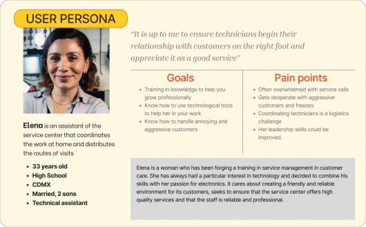
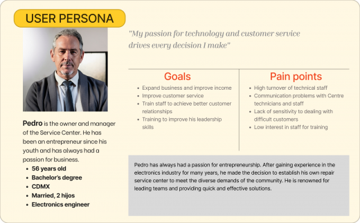
USER PERSONA
Identified four types of users that make up the work community in Service Centers associated with Samsung


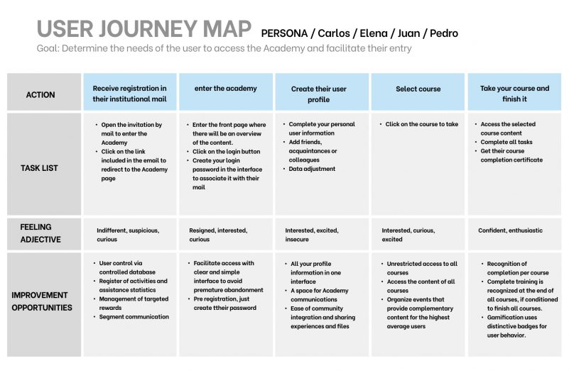
USER JOURNEY
Identify the needs of users in a general way to facilitate access to the Academy and avoid abandonment and motivate continued participation, creating community with all Service Centers associated with the Brand
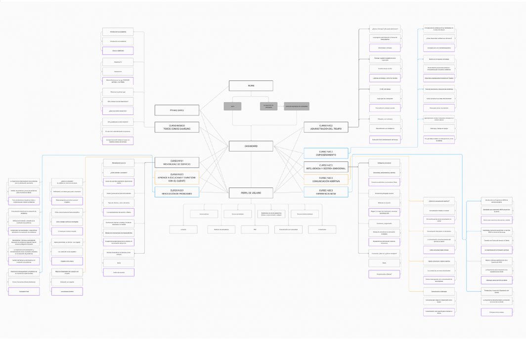
SITE STRUCTURE
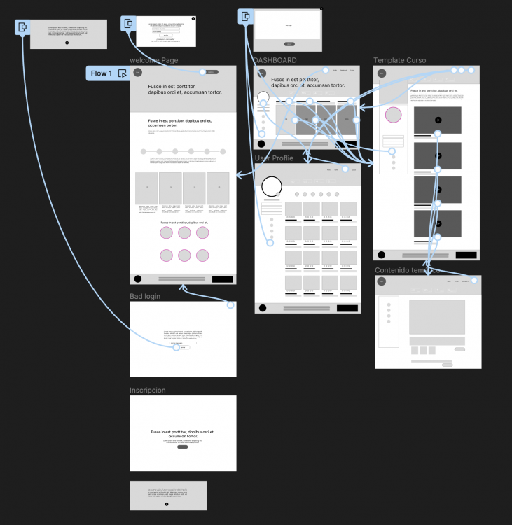
LOW FIDELITY PROTOTYPE
Taking into consideration the insights obtained during the generation of the user persona and the user journey, parameters were established to initiate a low fidelity ptototype to perform a usability test
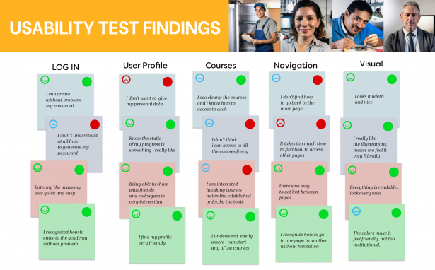
USABILITY TEST
FINDINGS | ACTIONS |
|---|---|
Problems returning to pages randomly | Facilitate access identification to navigate back and forth |
Interpretation of not being able to freely access courses | Generate an open menu with distinctive images of each course with access legend |
Take too much time to know how to navigate | Easier access and navigation tools, clearer and better located |
login creating only your password creates confusion | Create a simple and clear interface so that you only enter your password and there is no confusion of trying to create another user with different mail |
HIGH FIDELITY PROTOYPE
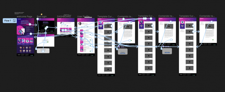
Considering the findings of the usability test, the high fidelity prototype was developed
FINAL PRODUCT
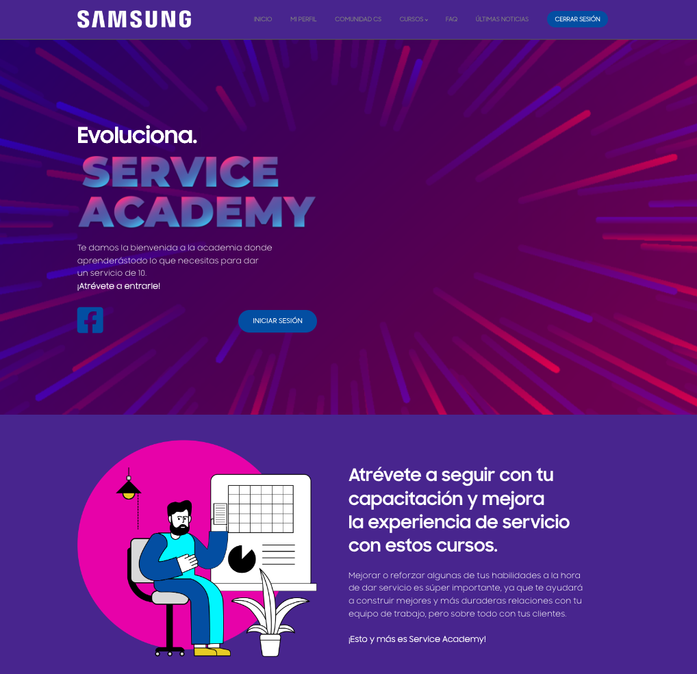
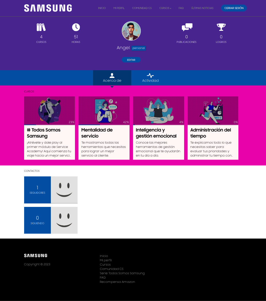
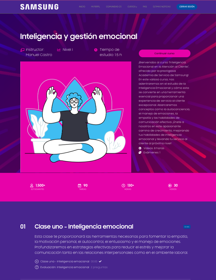
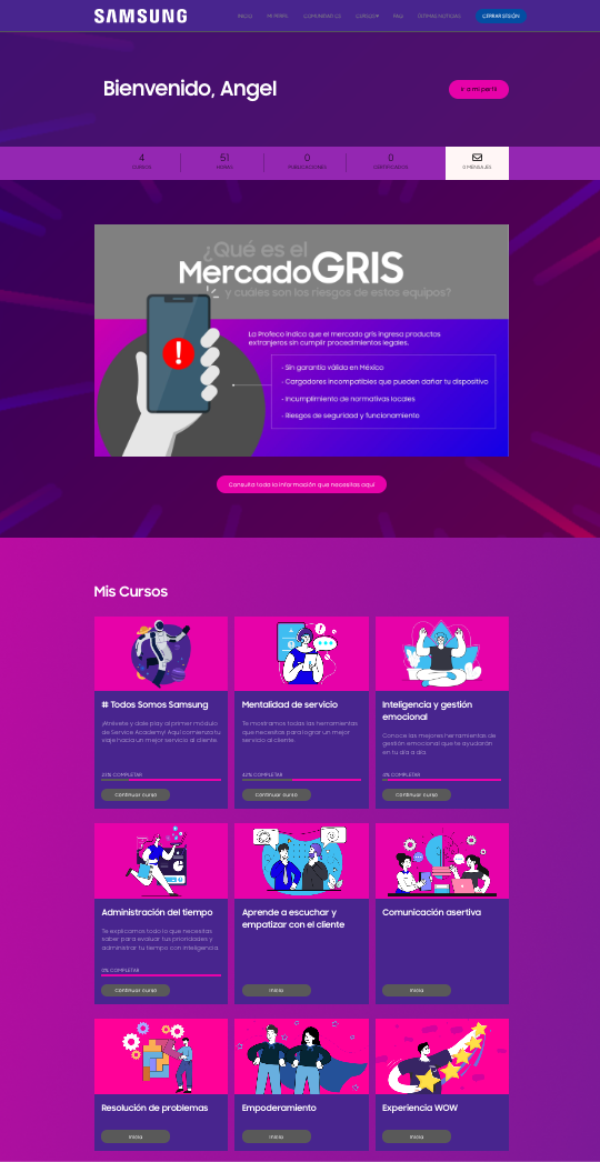
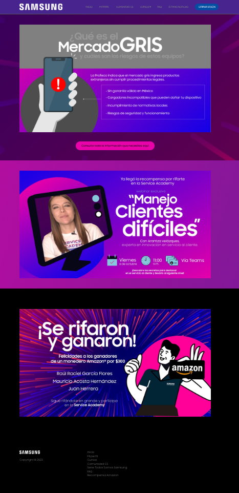
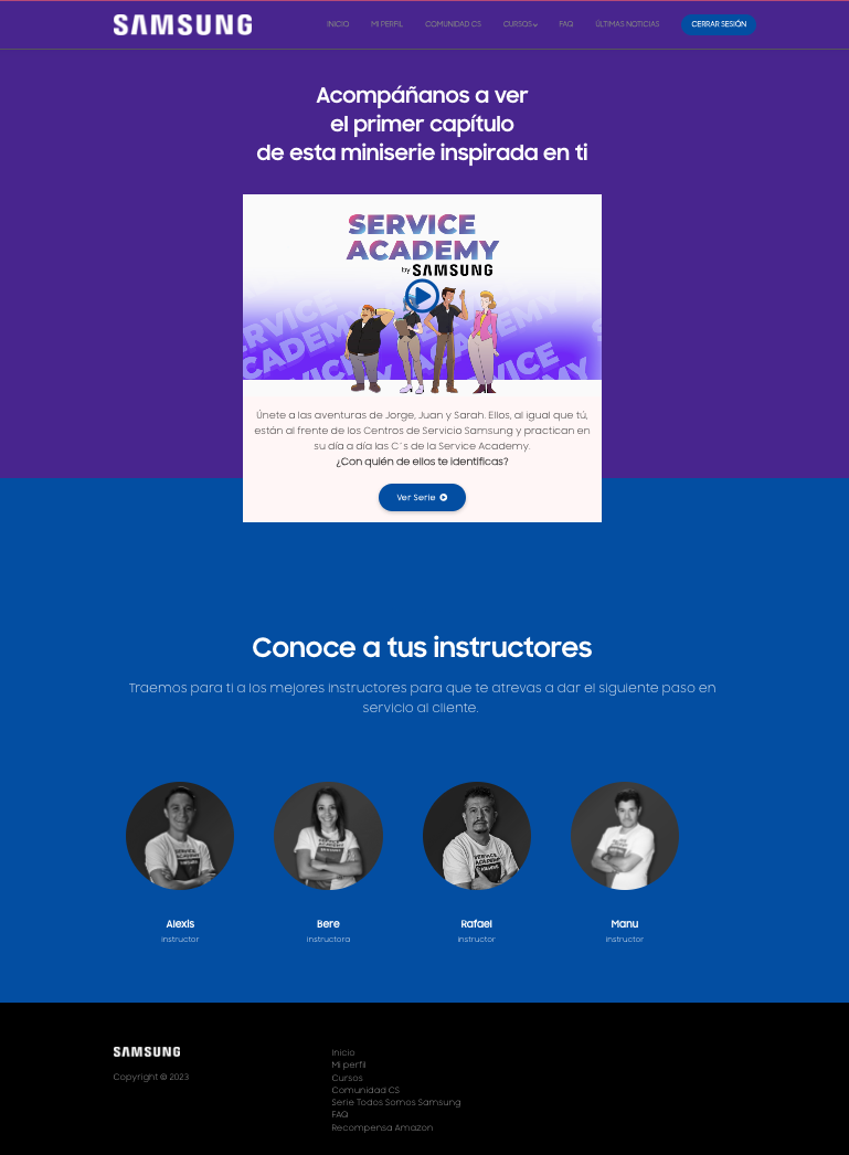
Due the privacy of the site, the next images show the final Academy interfaces, the last usability test was jumped to the final use of the site to make a continuous evaluation with the users about the navigation experience and interaction problems. I share the link to the main page, but no registered user will be accepted to enter.
VISUAL COMMUNICATION
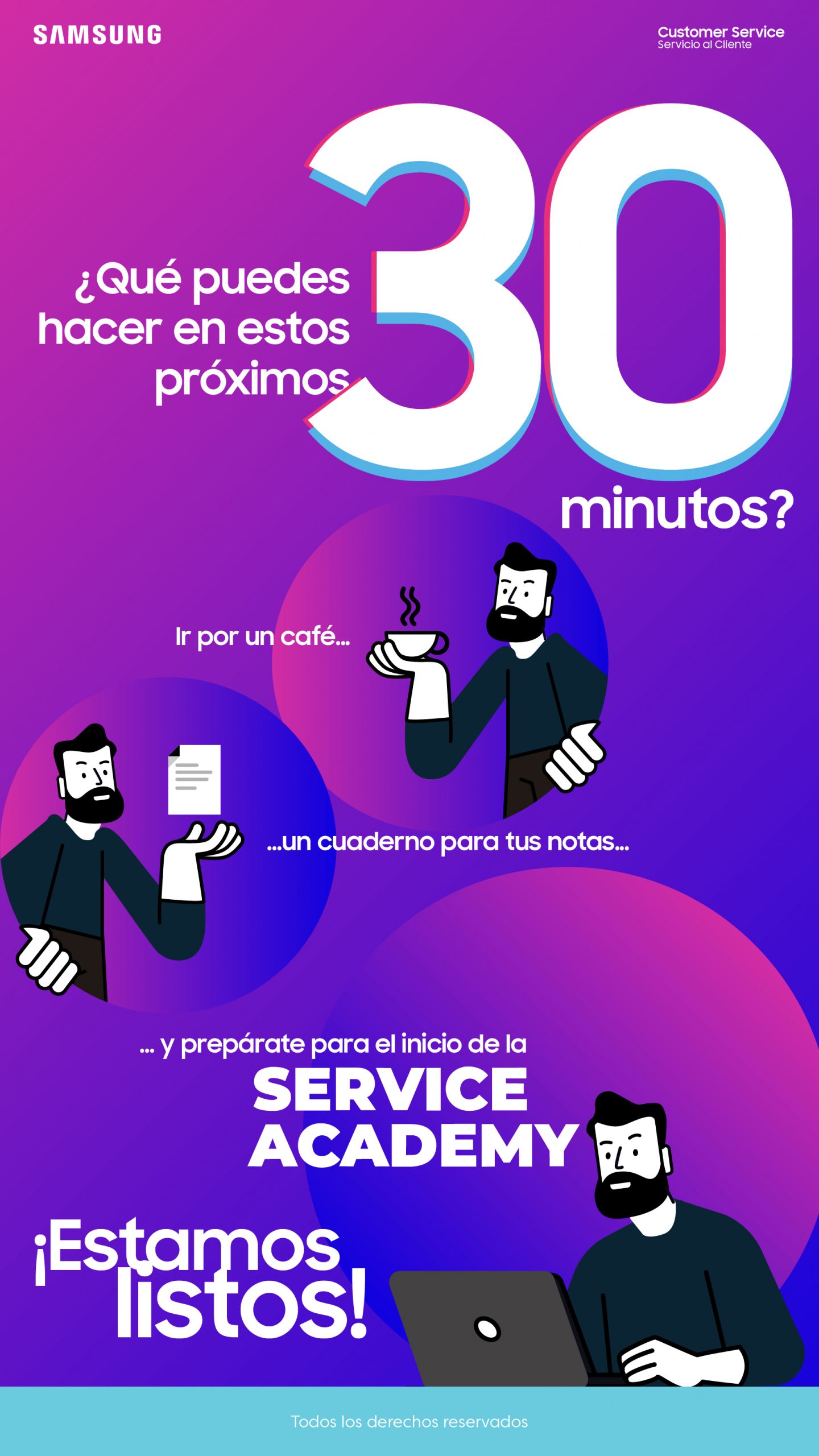
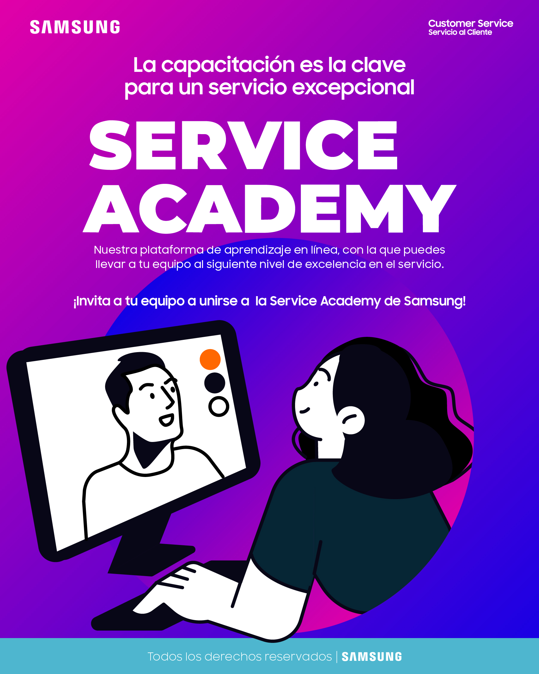
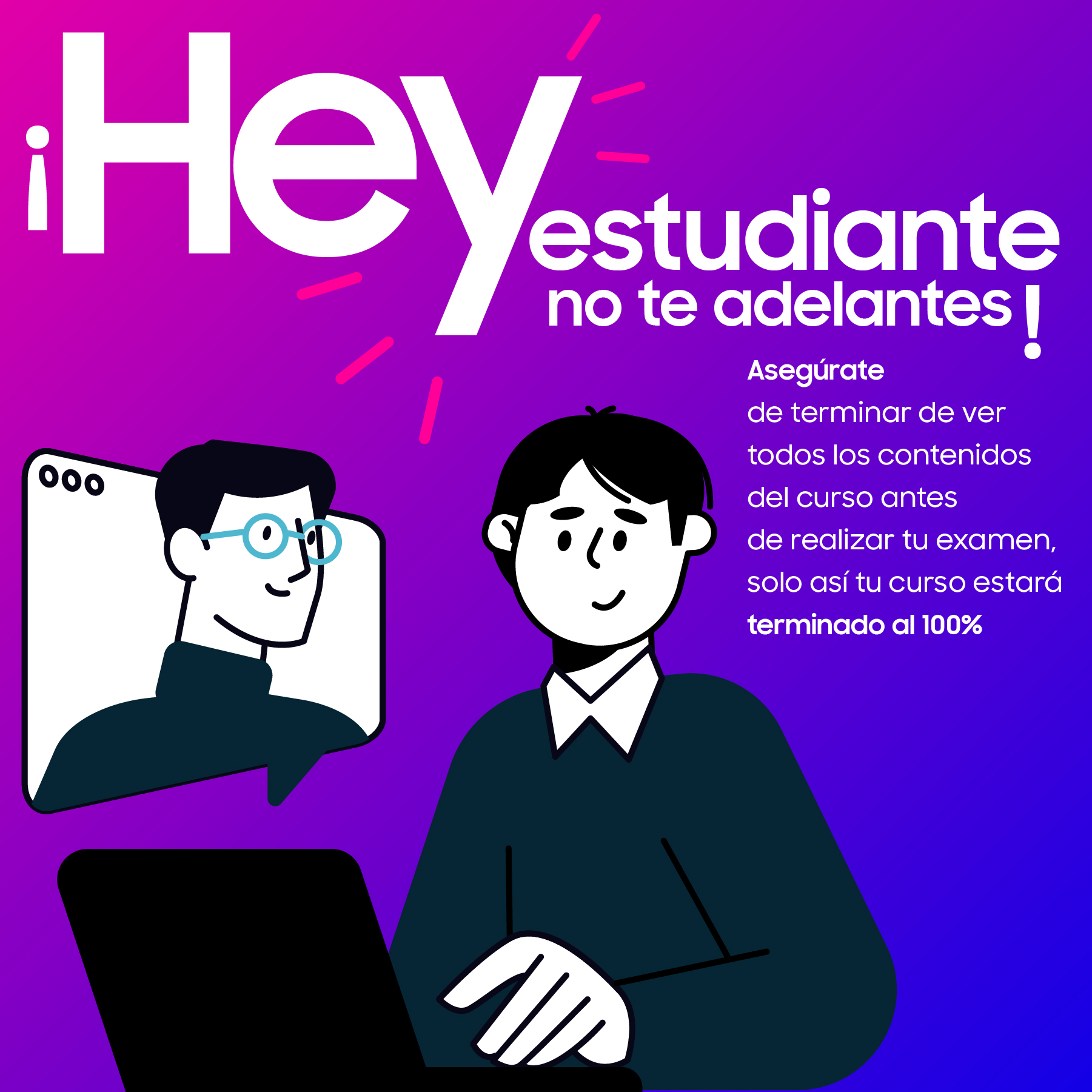
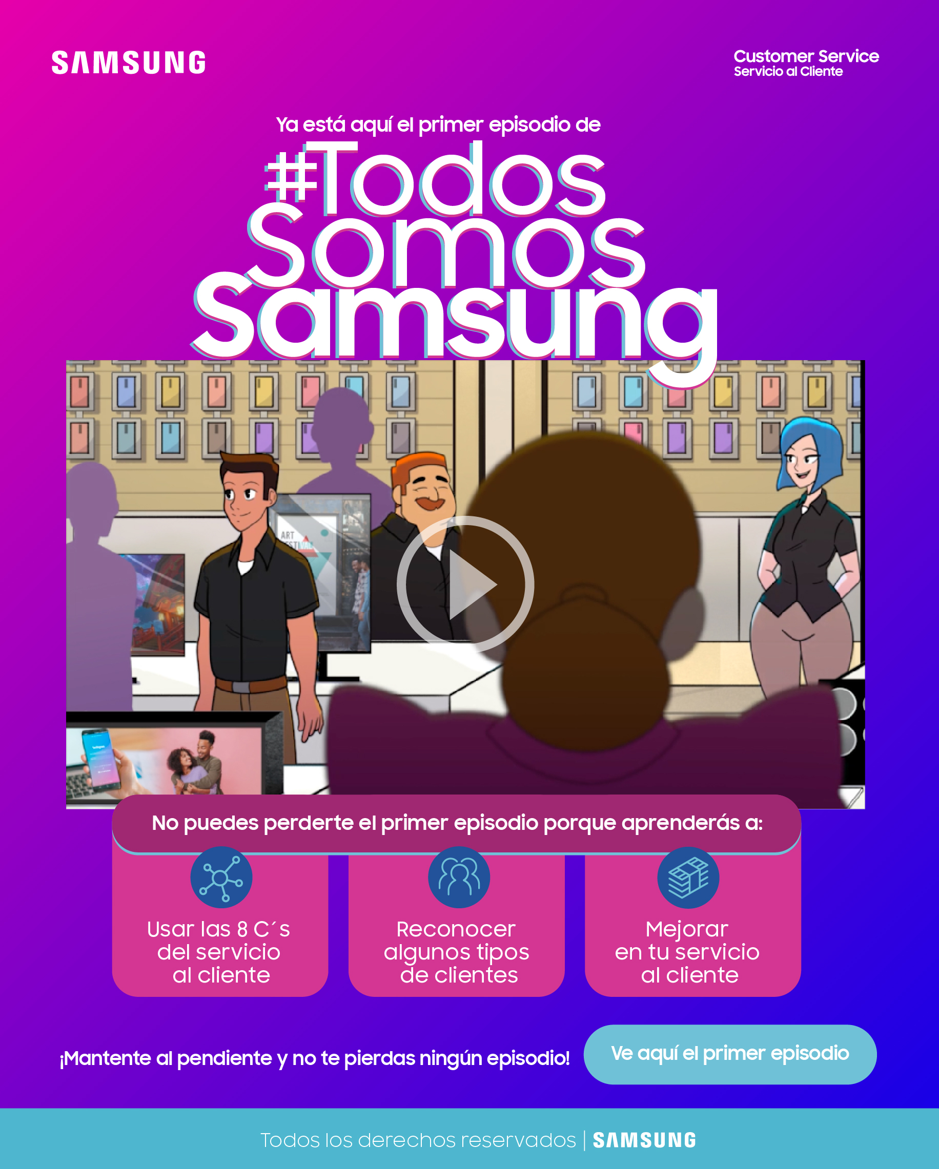
As a result of the derivation of the graphic style of the interfaces, this was also taken to the visual communication of the Academy, preserving the style of the illustrations and the color palette. The main communication was for the corporate mail, and whatsapp.
ACCESSIBILITY CONSIDERATIONS
Although our users are a controlled group we should not leave out some considerations to adapt and integrate experiences for all types of user
TAKEAWAYS
Users' characteristics require a constant push to motivate them to take courses during their working hours, which leads to constant communication with them.
Staff turnover is excessive so the platform must remain open constantly and in continuous maintenance
The user tends not to read the instructions in the login section, so the interface has to be developed in the most intuitive and simple way possible
NEXT STEPS
PLATFORM CHANGE
The success of the academy (about 95% of attendance and courses completed in the first 3 stages) is forecast to grow by 2024, so a platform will be needed that allows us to grow it and adapt the obtaining of data in a better way
LATAM EXPANSION
Growth in 2024 includes the extension of the academy to the LATAM network
UX ADJUSTMENTS
When considering users from different cultures in the network, other research will have to be developed to adjust the user experience in the Academy as well as the adjustments in accessibility
UX / UI
Knowing the user / the client / the consumer is the best way to functionality and for a well done design.
This is the way of the insights.



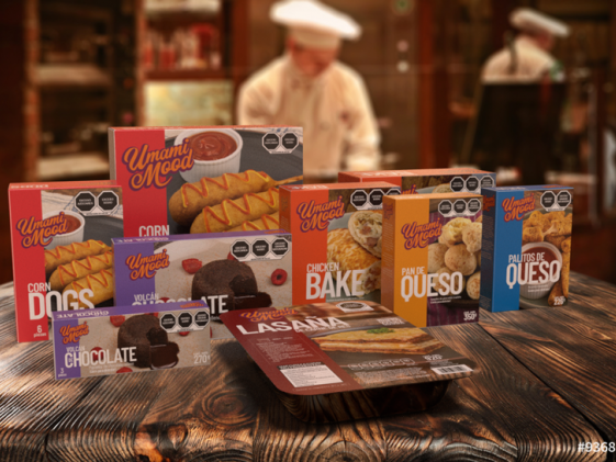
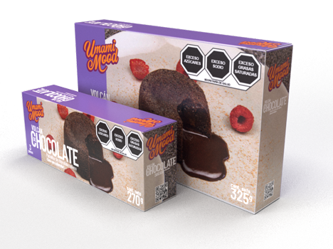
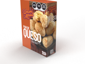
UMAMI MOOD
PROJECT
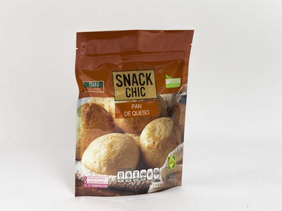
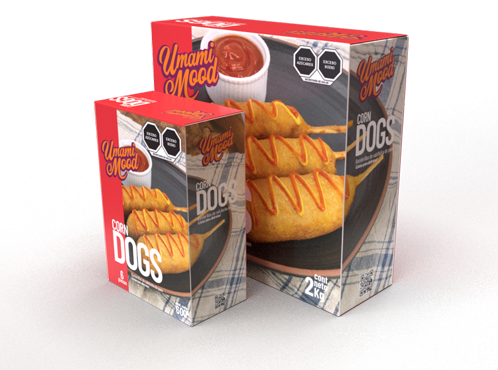
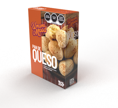
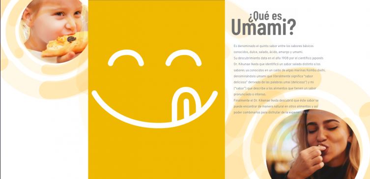
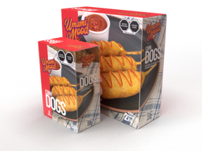
Develop the packaging design and website for UMAMI MOOD frozen products brand.
ROLE
- Brand Designer
- Packaging Designer
- Webpage Designer (UI)
- Art Direction
DURATION
Sep 2020 - Dic 2022

EGG PLANET
PROJECT
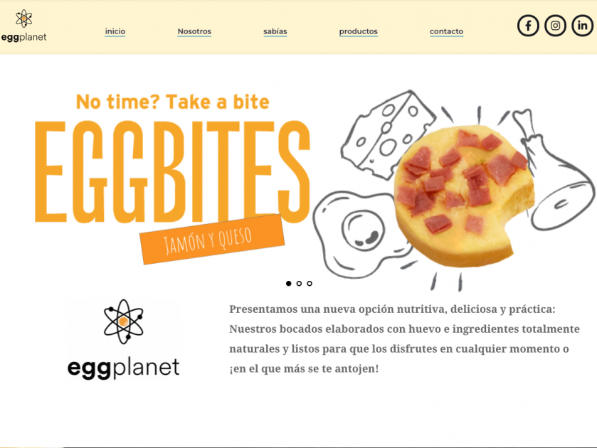
Packaging redesign and website design
ROLE
Packaging Designer
Web Designer (UI)
DURATION
Sep 2020 - Dic 2022


SOCIAL NETWORK
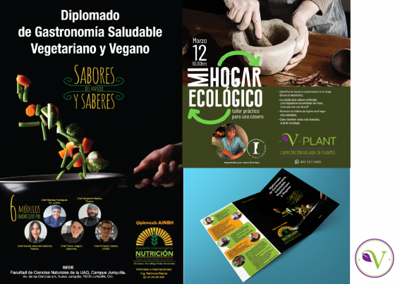


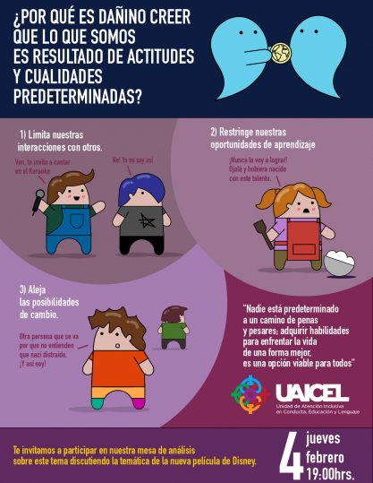



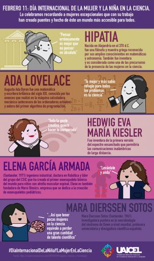
UAICEL is an association of young psychologists working in behavioral analysis, education and language, specialized in gender equality and inclusion.
Work developed for the brand:
- Institutional visual identity design.
- Graphic applications of visual identity.
- Illustrative style design.
- Content development.
- Management and coordination of publications.
- Development and planning of events and their communication.
- Design of publications.
PUBLISHING
AVENTURAS EN AZUL
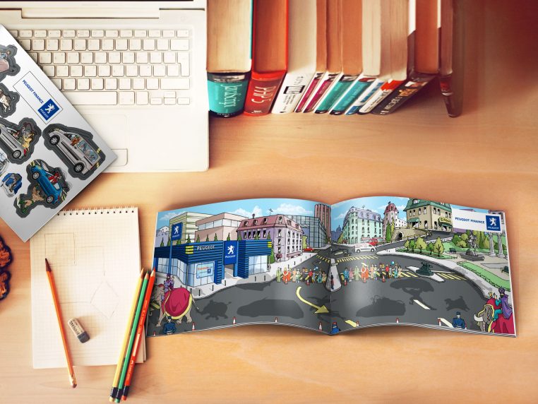
Promotional brochure designed to provide an entertaining experience for children while the executive shows the product to parents.
The brochure is intended to be an interactive material that allows the child to have contact with the Brand and create stories related to its products.
The booklet contained stickers that could be placed anywhere inside and thus form a story of their own.
REEL


